0: Prototype
To change the device mode, simply go to the Flows menu located in the top-left corner.
1: Context
How might we improve the user experience on the website while also enhancing its brand identity?
Rainbow Play Cafe, located in New Westminster, BC, Canada, offers a unique experience where children can delight in the indoor playground while their guardians savor coffee.
Problem
- Third-party Redirect: Users directed to Simpletix for booking, adding an extra step.
- Information Architecture: Navigation menus need simplified, and hierarchy on Booking and Birthday Party pages can be enhanced.
- Admission Fee Presentation: Visual representation of Admission Fee needs improvement.
These problem status were set by the research conducted below.
2: Research
Heuristic evaluation
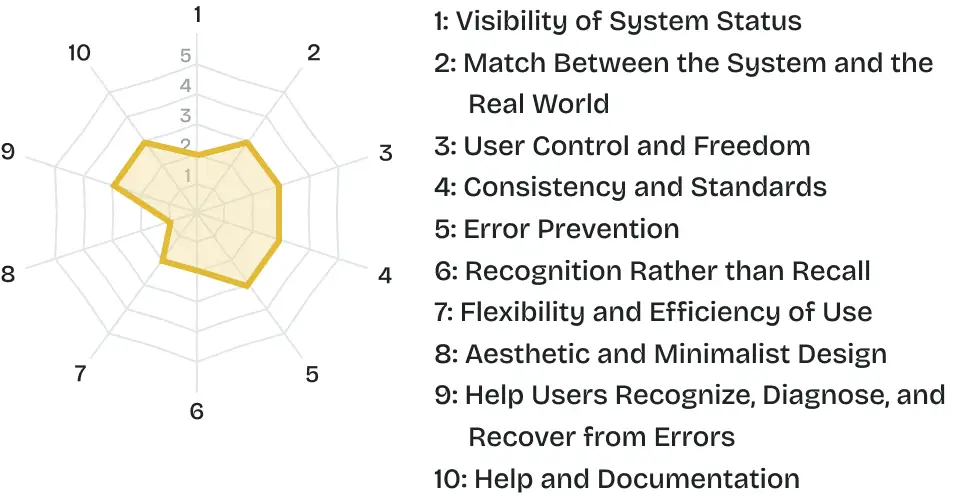
To gather user pain point efficiently, we carried out heuristic evaluation at first.
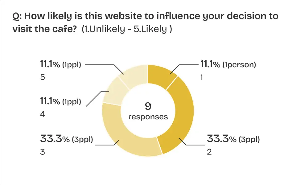
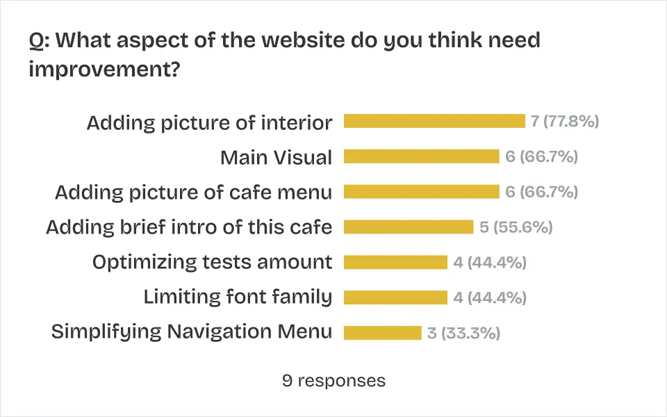
User survey
Based on the results of the heuristic evaluation, we worked on user survey and lead the problem status.

Client meeting
We visit the cafe and conducted an interview with the client while also observing the target users. We found these key client needs;
- Admission Fee Clarity
- Clarifying the payment process for Birthday Party Bookings
- Adding Calendar function for Booking page
- Enhancing Branding identity
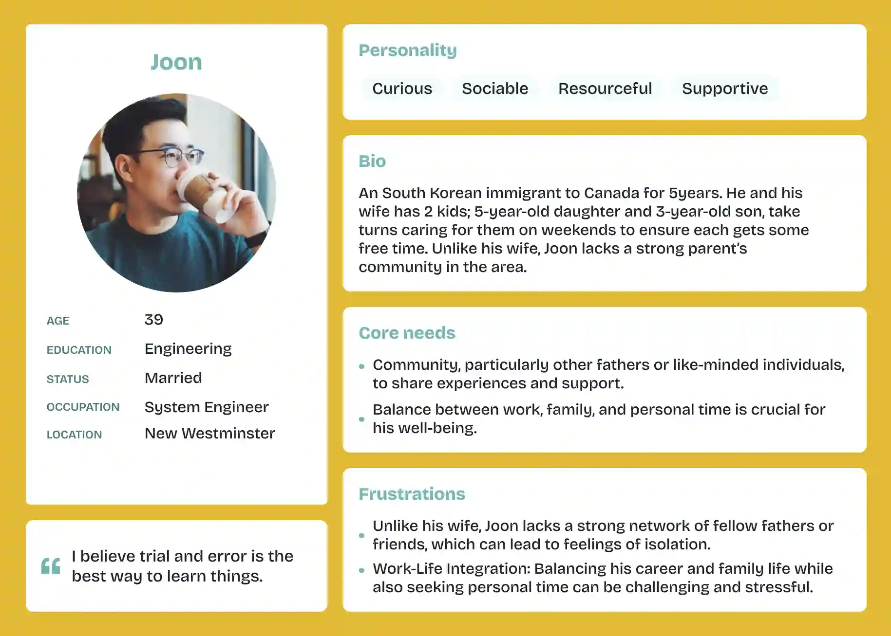
Persona
Based on the target users of this cafe, we developed two personas and considered how the cafe can cater to these users by leveraging its strengths.
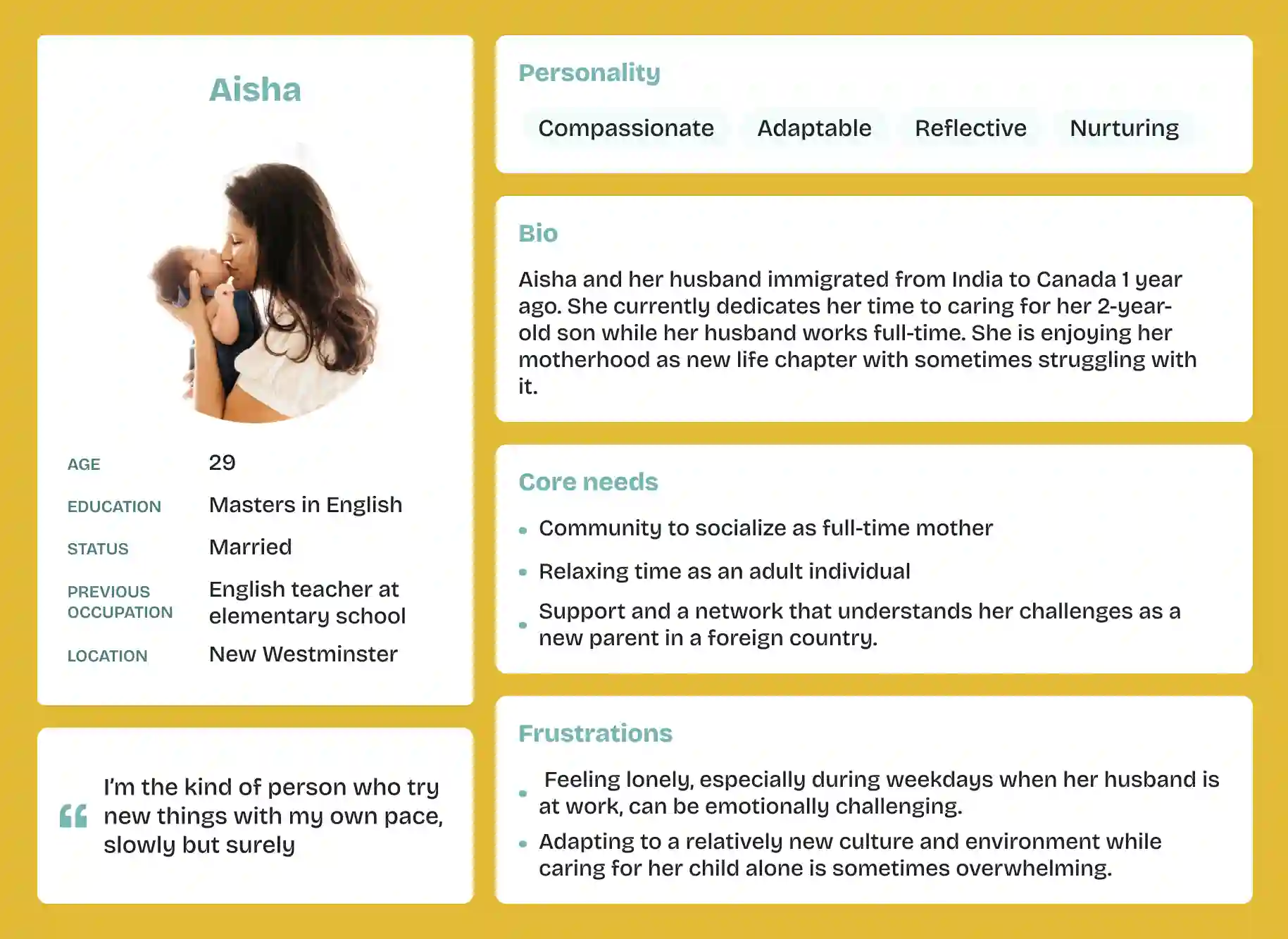
- Aisha: The owner's international background as a mother brings a sense of empathy.
- Joon: The inclusion of sophisticated toys could serve as a positive touch point.
3: Ideate
Sitemap
Before designing, we noticed that there were 9 menus in the header navigation, and most of them didn't have sub-menus. We opted to follow Hick's Law, which suggests that decision-making time increases with more choices. In terms of navigation menus, cutting down on options helps users make decisions more swiftly and easily.
Before -> After
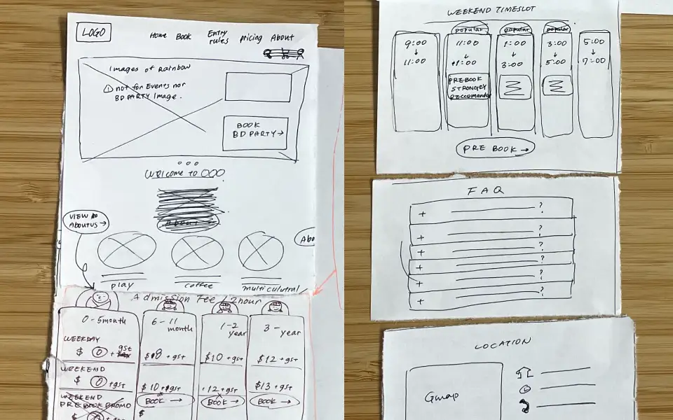
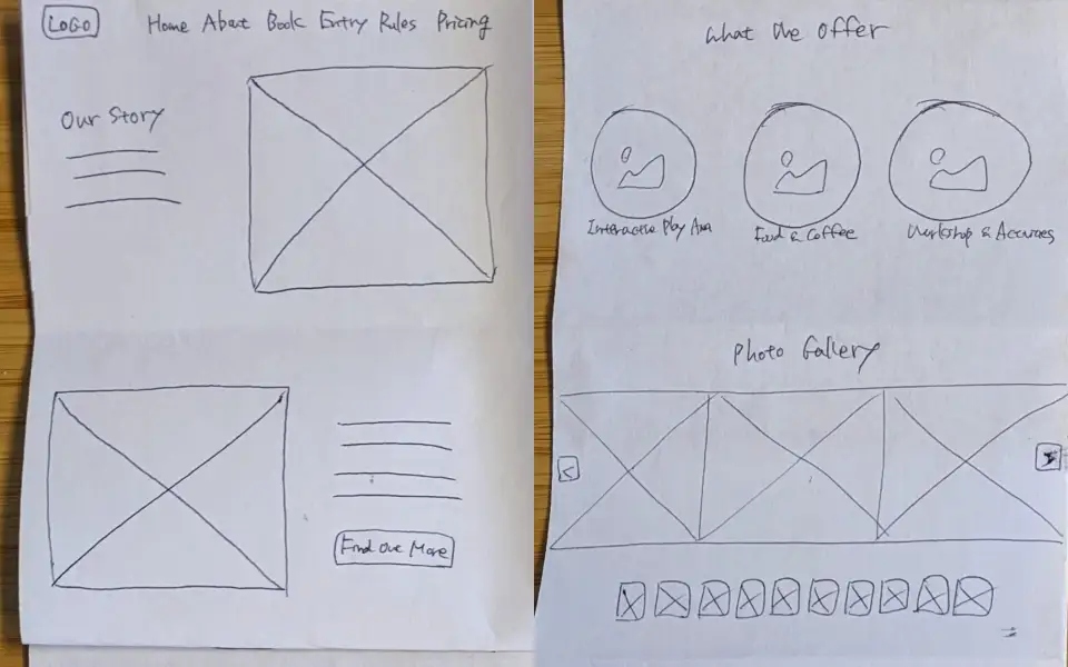
Wireframe
Low fidelity wireframe
We applied a Solution Sketch to our low-fidelity wireframe building for communication and collaboration.
High fidelity wireframe
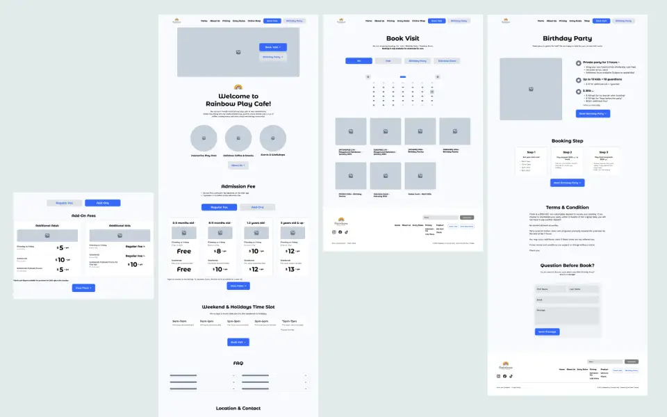
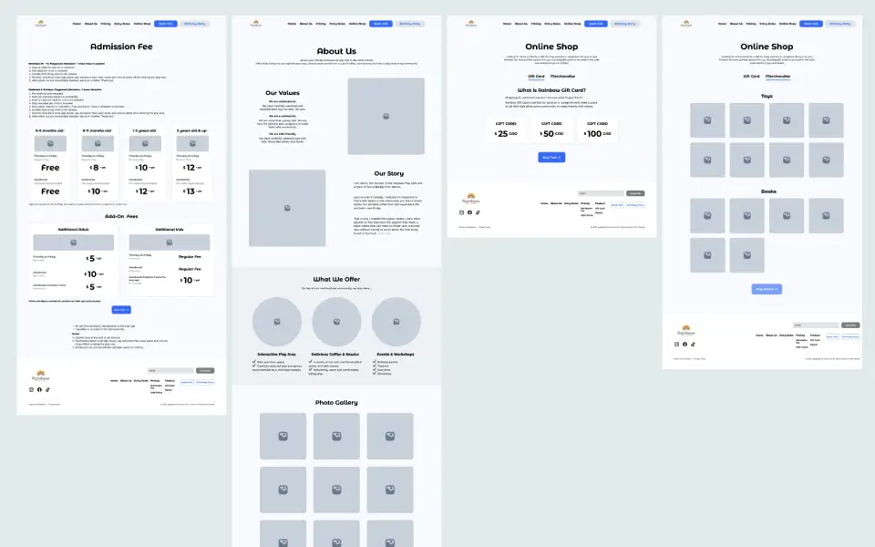
We crafted a high-fidelity wireframe and utilized it for usability testing, focusing on tasks tailored to alleviate user pain points and emphasize key elements desired by the client. The results from this testing confirmed that the proposed new information architecture would be more effective.
Platform limitation research
We checked the limitations of both the site builder (GoDaddy) and the payment system (Simpletix) to ensure the feasibility of our design. Since the client's paid plan and our free trial plan had different limitation, we identified alternative approaches. For instance,
- Font Family: The chosen font family was unavailable in trial plan, but it can be installed in a paid plan.
- Card Design: Exporting the card as a PNG image or implementing custom coding could make it happen.
- Calendar Design / CTA Button: We confirmed the existence of code that could be embedded into the GoDaddy website for calendar design and CTV buttons.
4: Solution
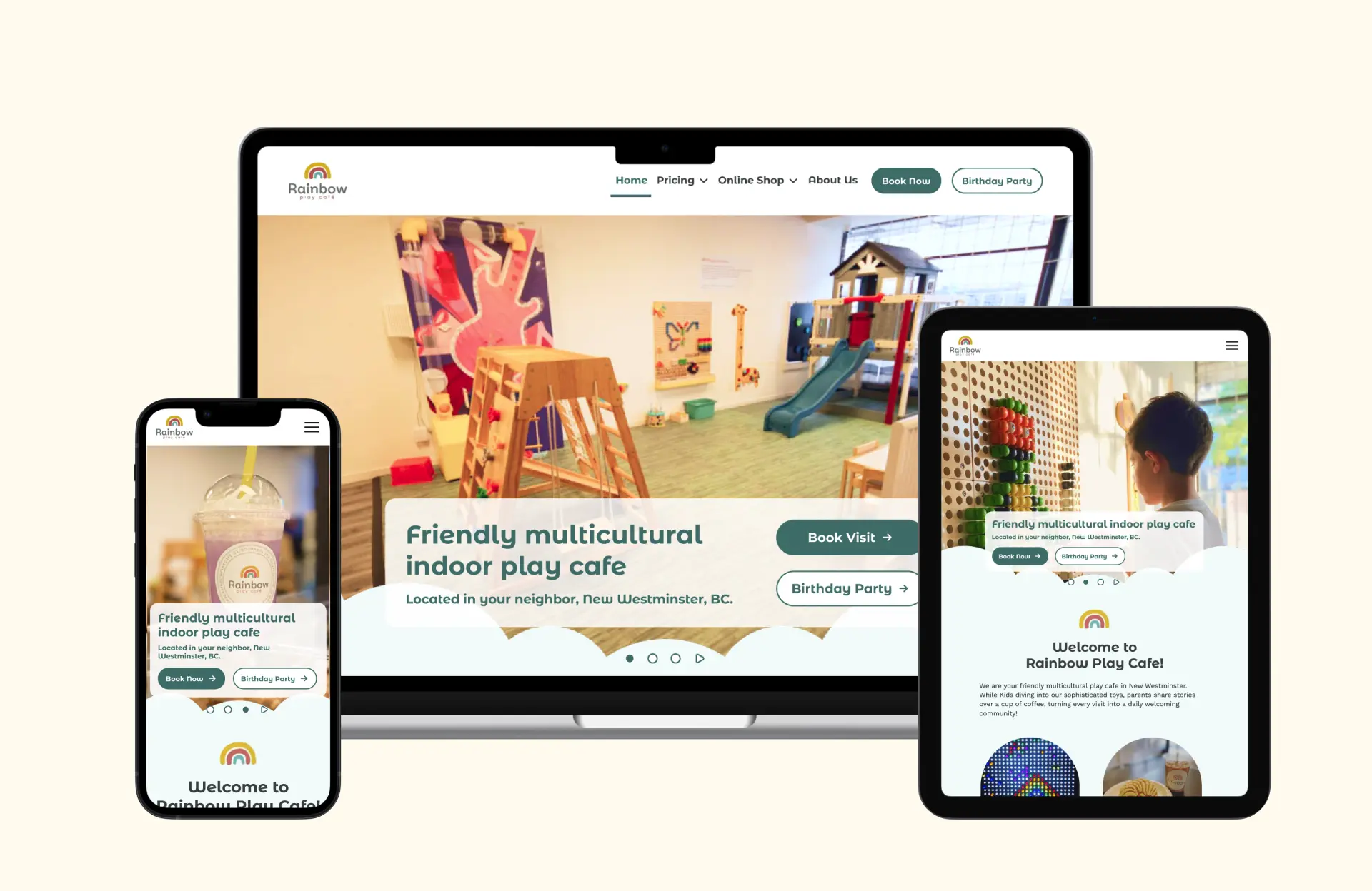
We designed the core 7pages — Home / Birthday Party / Booking / About Us / Online Shop / Admission Fee / Cafe Menu—ensuring responsiveness across 3 devices: Desktop / Tablet / Phone. This task was completed within 1 week.
4.1 Core improvements
Home
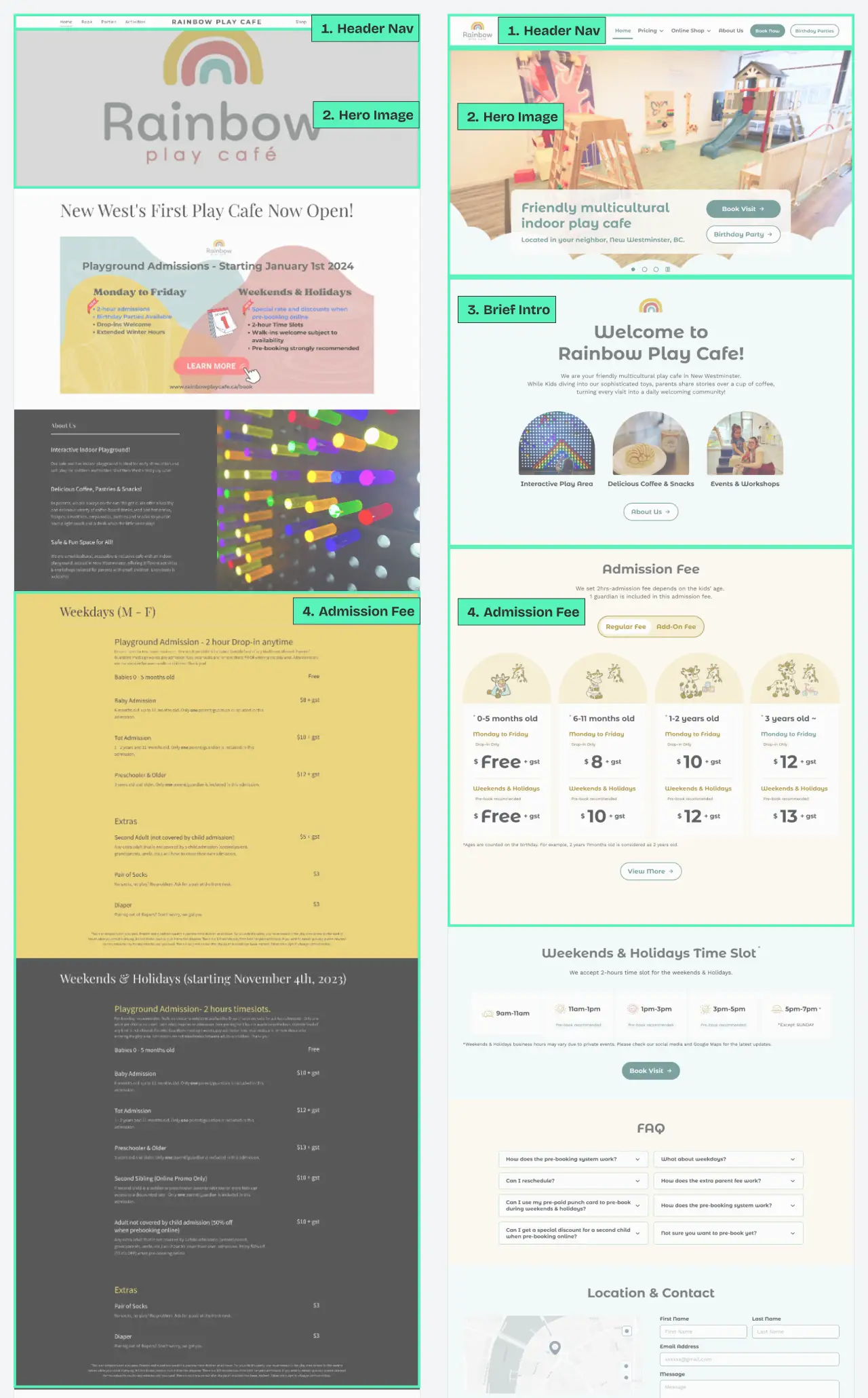
Before -> After
- Header Navigation: "Book" and "Birthday Party" are emphasized as CTA buttons. By implementing a dropdown menu for the sub-menu, the main menu now features only 4menu+2CTA options.
- Hero images: 3 pictures have been added to convey the atmosphere of the cafe.
- Brief intro: A concise introduction is showcased, outlining what the Rainbow Cafe is all about
- Admission Fee: Card design was applied to facilitate easier comparison of pricing based on ages and days. The use of a tab menu ensures this section is not overly lengthy.
Booking Page
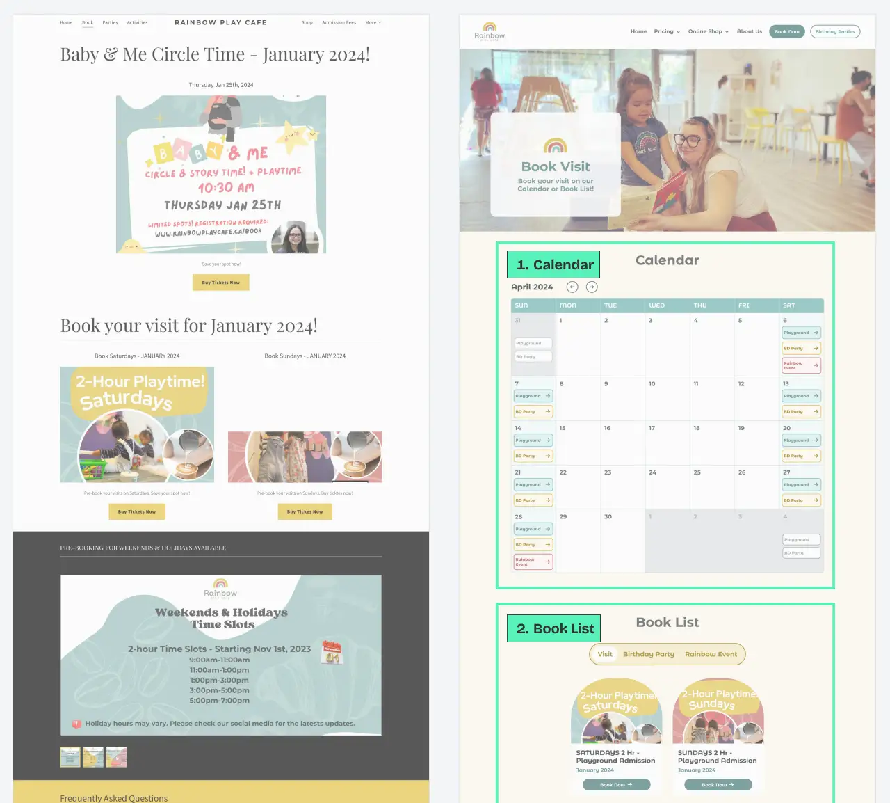
Before -> After
- Calendar: Enabling Users to book from specific dates, allowing for clear identification of available and unavailable dates.
- Book list: All bookable events have been gathered on this page and organized into 3 categories: Regular visits, Birthday parties, and Rainbow Events.
- Internal payment: By embedding the Simpletix code, users can seamlessly complete payments directly on this website.
Birthday Party Page
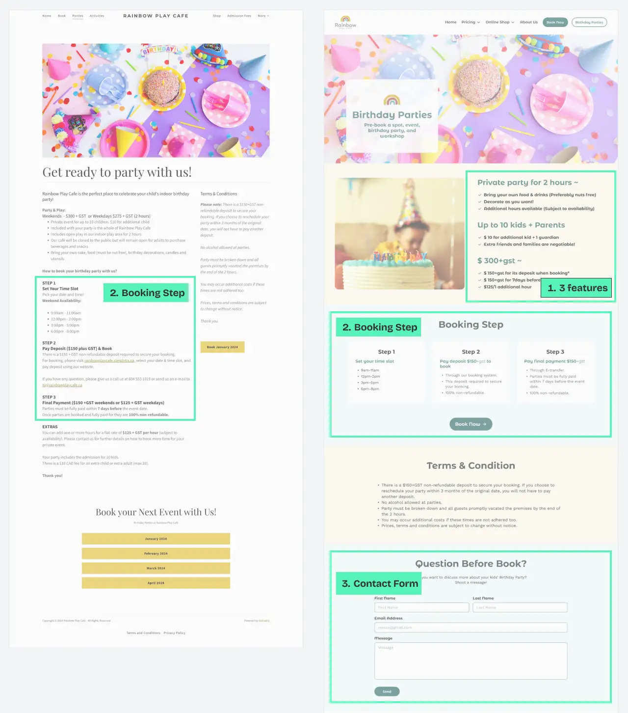
Before -> After
- Highlighted 3 features: We've organized and listed the key features of the birthday plan at Rainbow Cafe, making it easy for users to review.
- Booking Step: The booking process has been visualized to help users quickly grasp the necessary steps.
- Contact form: A contact form has been added to streamline the planning process for both the user and the client. (Previously, the client received bookings through phone calls, emails, or Instagram.)
4.2 Other improvements
Behind scene section
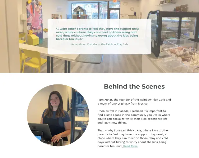
To enhance credibility and create empathy by sharing similar situations with users, we added anecdotes and background stories on the About Us page.
Merchandises page

Incorporated sophisticated toys as the client expressed interest in our offer of selling curated toys and books online.
Terms section
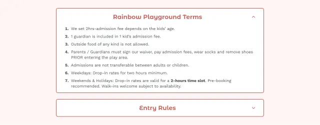
Placed at the top of the Admission Fee page to ensure users don't miss it. Utilized an accordion design to conserve space.
Cafe Menu page

Introduced a "Kid's Favorite Menu" for users who want a quick overview of what's available for their kids.
Gift Card page
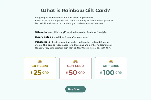
Added details on where to use, expiry date, and notes to provide a quick understanding of how to use the card.
4.3 Design System
Color / Typography / Illustration
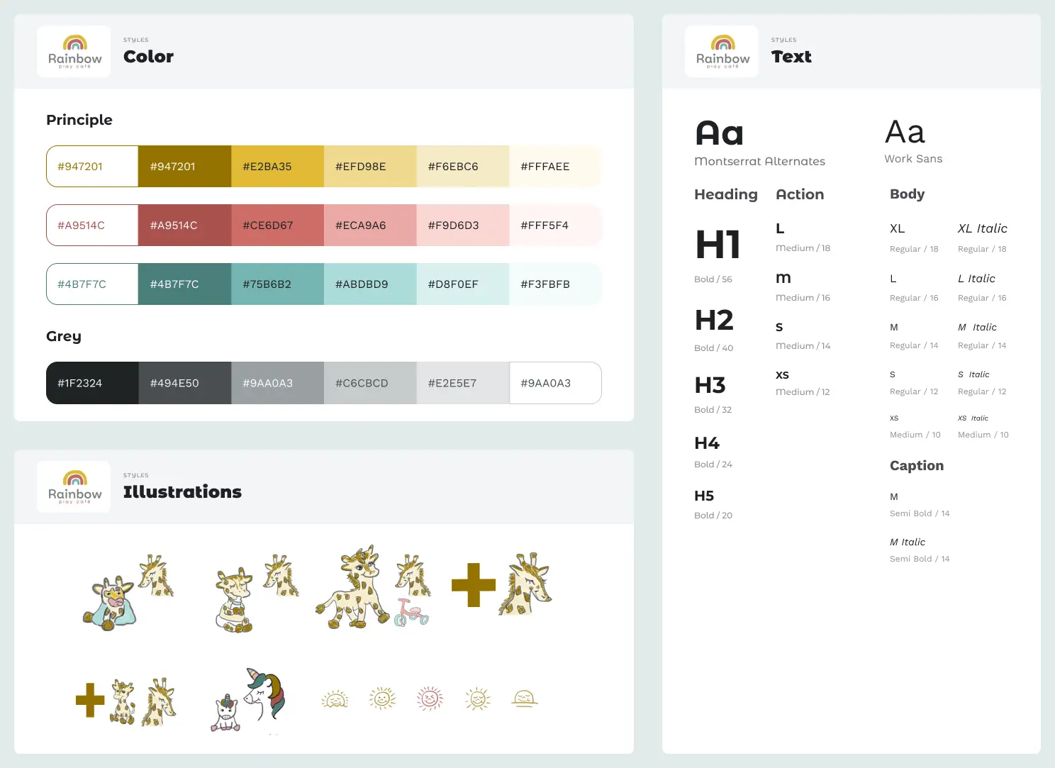
- Color
- 2colors were chosen based on the logo color, taking into account the contrast to meet web accessibility standards.
- Typography
- 2 kinds of round-shaped fonts were selected to represents this friendly cafe.
- Montserrat Alternative: Dynamic and playful atmosphere, complementing the rounded shapes seen in some graphics on the current website and Instagram posts.
- Work Sans: For paragraphs or lists requiring readability, we opted for "Work Sans," which also has a rounded shape.
- Illustration
- Our illustrator, Tomomi Uji, skillfully created illustrations inspired by the cafe's giraffe toy collection, using the logo color. These illustrations contribute a warm and welcoming vibe, adding a unique touch to the website.
Variables / Components

To ensure consistency and efficiency in collaboration with the rest of the design team, I took the initiative to create variables and components. I then shared the rationale behind them, along with instructions on how to use them and any applicable rules.
Responsive Design File
To achieve responsive design from this phase, I employed a method where I set max-width and min-width for each section. This allowed us to create and confirm the appearance for different screen widths while working on the design.
5: Evaluate
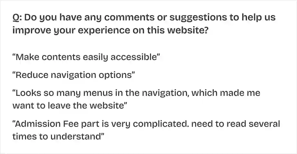
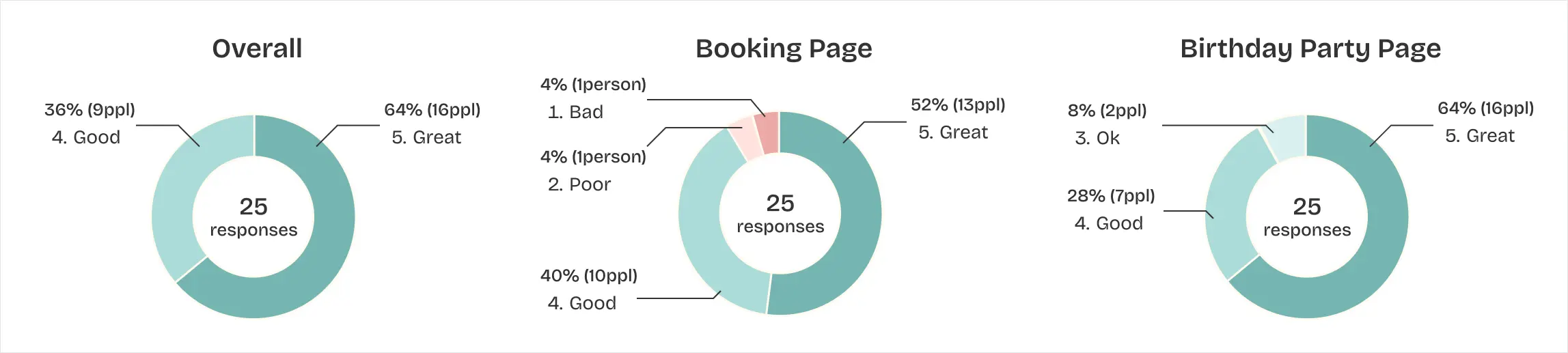
5.1 User Survey
To evaluate our design, we conducted online user survey and 24 people responded.
Q: Rate the experience on each page on scale of 1 to 5 (1:Bad 2:Poor 3:Ok 4:Good 5:Great)
👍 Positive Feedback
- The renewed design makes categories and prices clearer.
- Visual hierarchy works well.
- The renewed design helped me to achieve the task quicker thanks to the self-explanatory heading and the font style.
✍ Next Step
- Adding testimonial to hear other mom's voice.
- Adding more photos of the playground area to attract kids.
- Supporting other languages.
6: Takeaway
6.1 Looking back and moving forward
- Leading team as a designer:
Balancing UI design responsibilities while taking the lead as the project leader presented a new challenge. Beyond focusing solely on design improvements, I had to drive the project forward. This experience was significant, and I am eager to embrace such a role again. - Collaboration on a design file:
I introduced "Variables" in Figma to enhance design consistency and efficiency. Sharing this with my teammates not only improved technical aspects but also deepened my understanding of collaboration with another designer for a single project.