0: Prototype
To change the device mode, simply go to the Flows menu located in the top-left corner.
Some images and texts are dummy.
1: Context
How might we improve the brand identity and user experience on our website?
Problem
As a web designer who works at Moja Coffee as a barista, I've observed that our website doesn't effectively convey our brand identity - High quality / Trustworthy / Professional / Friendly / Community ,despite being one of the most cherished local cafes and roasters in Vancouver.
- Layout and Color Adjustment: Ensure website layout and colors match our café's professional image.
- Engaging visual Content: Enhance visual content to reflect the friendly café atmosphere for better engagement.
- Addition of High-Demand Content: Include essential content like cafe menu, ingredients, allergy details, and pricing on the website.
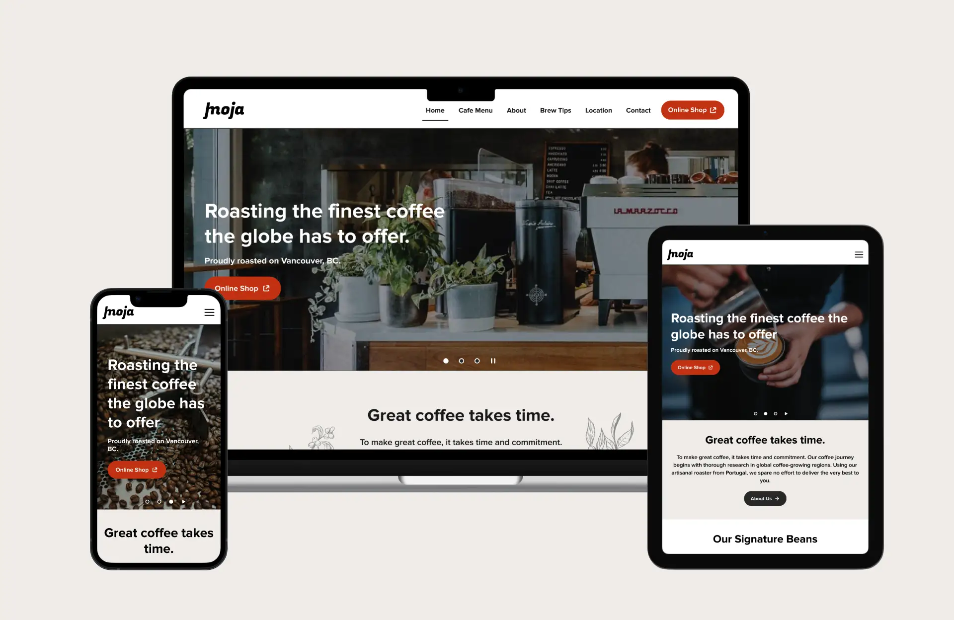
Original Website
2: Research
2.1 Gathering first impressions of the café's website.
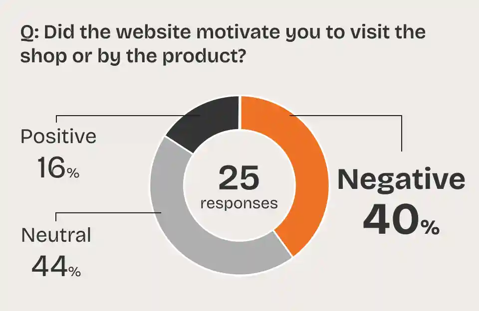
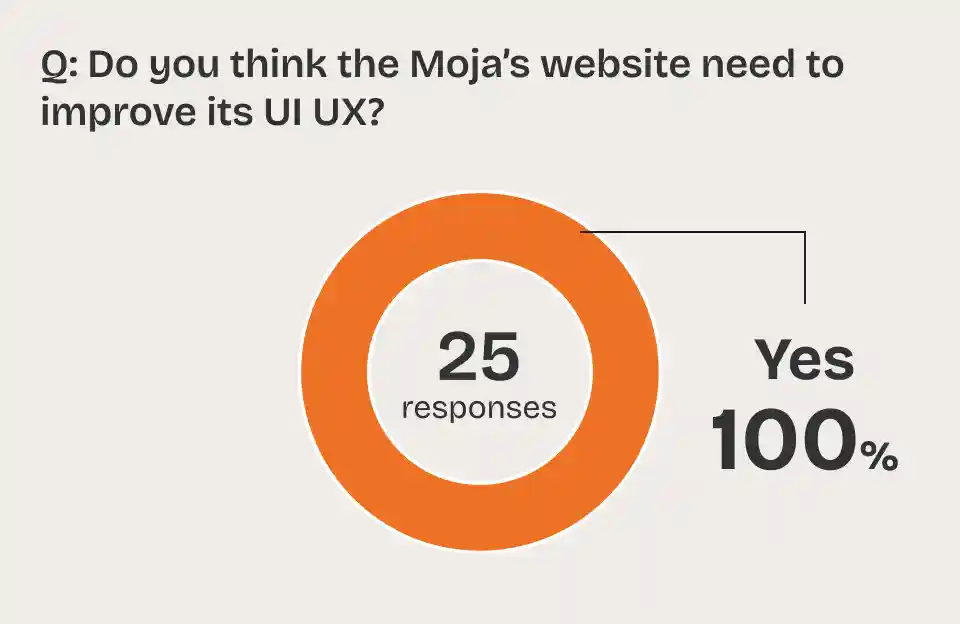
User survey
40% of the 25 people who responded didn't think the website was engaging. 100% of respondents answered that the website needs improvement.
User interview
Q: Does this website makes you want to visit or make purchase on this cafe brand?
- A-1: “No, because it's hard to know the atmosphere. It doesn't looks trustworthy.”
- A-2: “No, Their Instagram is better telling the vibe with the picture.”
- A-3: “No. Because it doesn't tell the comfortable atmosphere. For me, interior design matters when I choose cafe. Also spacing and layout looks not organized, and it leads to sense of less professionalism”
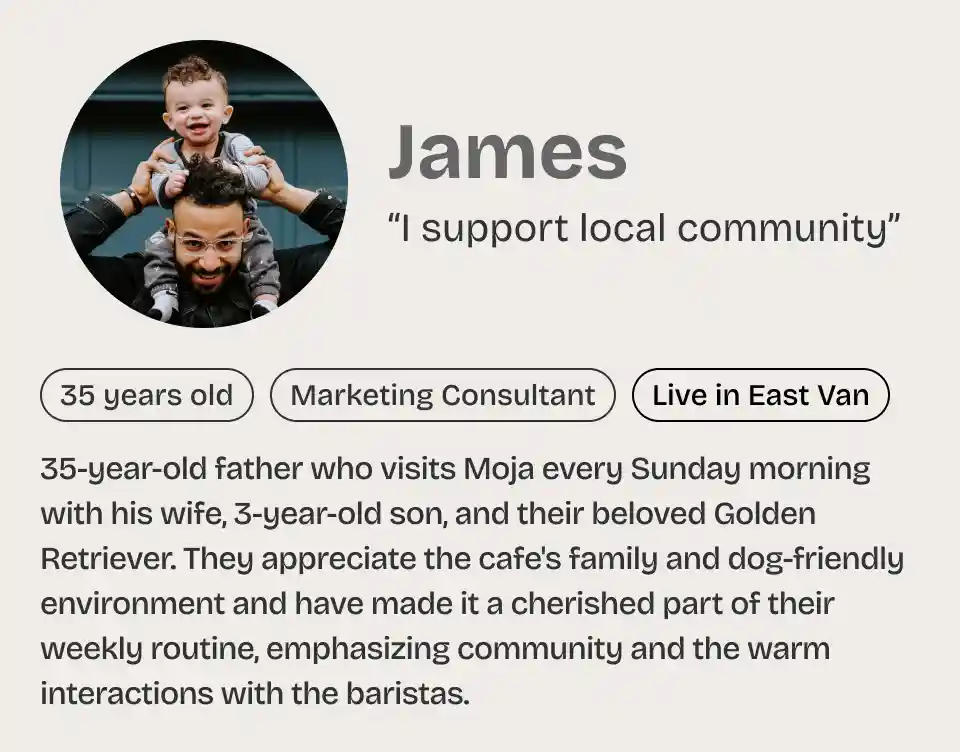
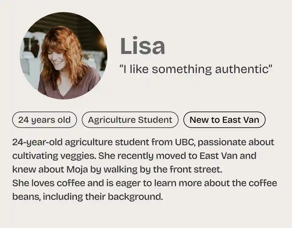
2.2 Knowing target viewer
Target persona
3: Design
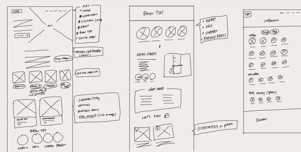
3.1 Wireframe
Lo-Fidelity wireframe
3.2 Design System
While sticking to the current primary color, I've taken care to select new colors, fonts, and a logo that could convey the brand identity better.
Logo (NEW)
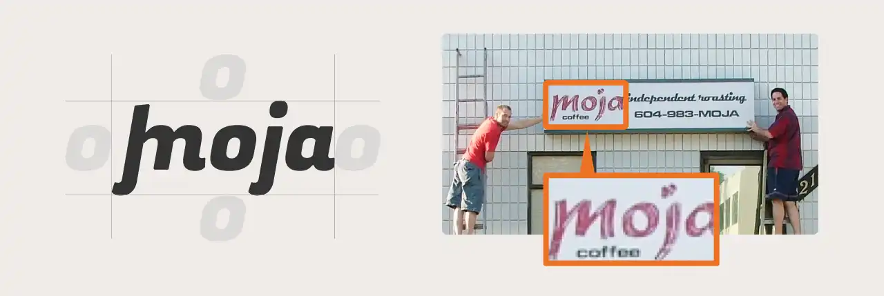
The logo design honors the early logo while commemorating the business's 20th anniversary with a reimagined version. By incorporating gothic font with an italicized, streamlined aesthetic, we aimed to create a design that radiates both friendliness and professionalism.
Color / Font
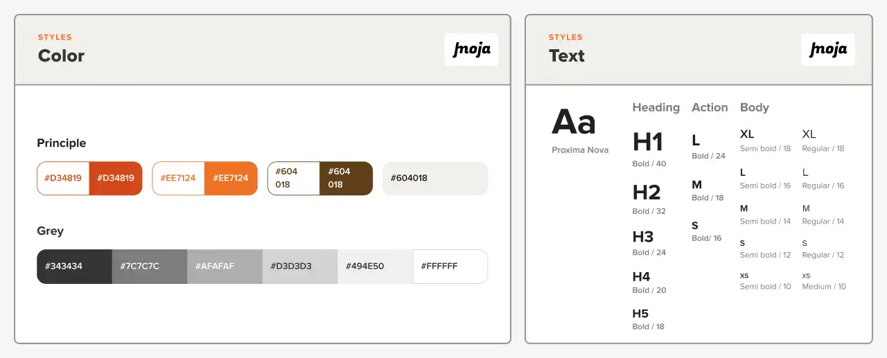
By implementing restrictions on color, font, and the use of capital letters, overall consistency has enhanced.
Components / Variables

To ensure consistency and efficiency in the iterative design process, design token and components are created.
4: Ideate
I designed the core 5 pages — Home / Cafe Menu (NEW) / Brew Tips / About / Location / Contact - all in responsive design across 3 devices: Desktop / Tablet / Phone.
4.1 Core Improvement
Home

Before -> After
- Hero Area: Enhanced readability by creating contrast between the background picture and text. Utilized a slideshow featuring images of cozy interiors / professional baristas / high-quality beans for the hero image.
- Intro: Optimized the amount of text for better user experience.
- CTA Link: Instead of just using a CTA button, showcased 3 popular coffee beans with direct links to their purchase pages. Since our online shop is external website, the external link icon was added, meeting WCAG Standards.
- Brew Tips: Improved the size and layout.
- Footer: Applied a footer.
Cafe Menu(NEW)
Crafted a high-demand page featuring drink and food types, prices, sizes, and ingredients. Small badges like "Vegan," "Gluten-free," or allergy icons indicate menu options.
Brew Tips
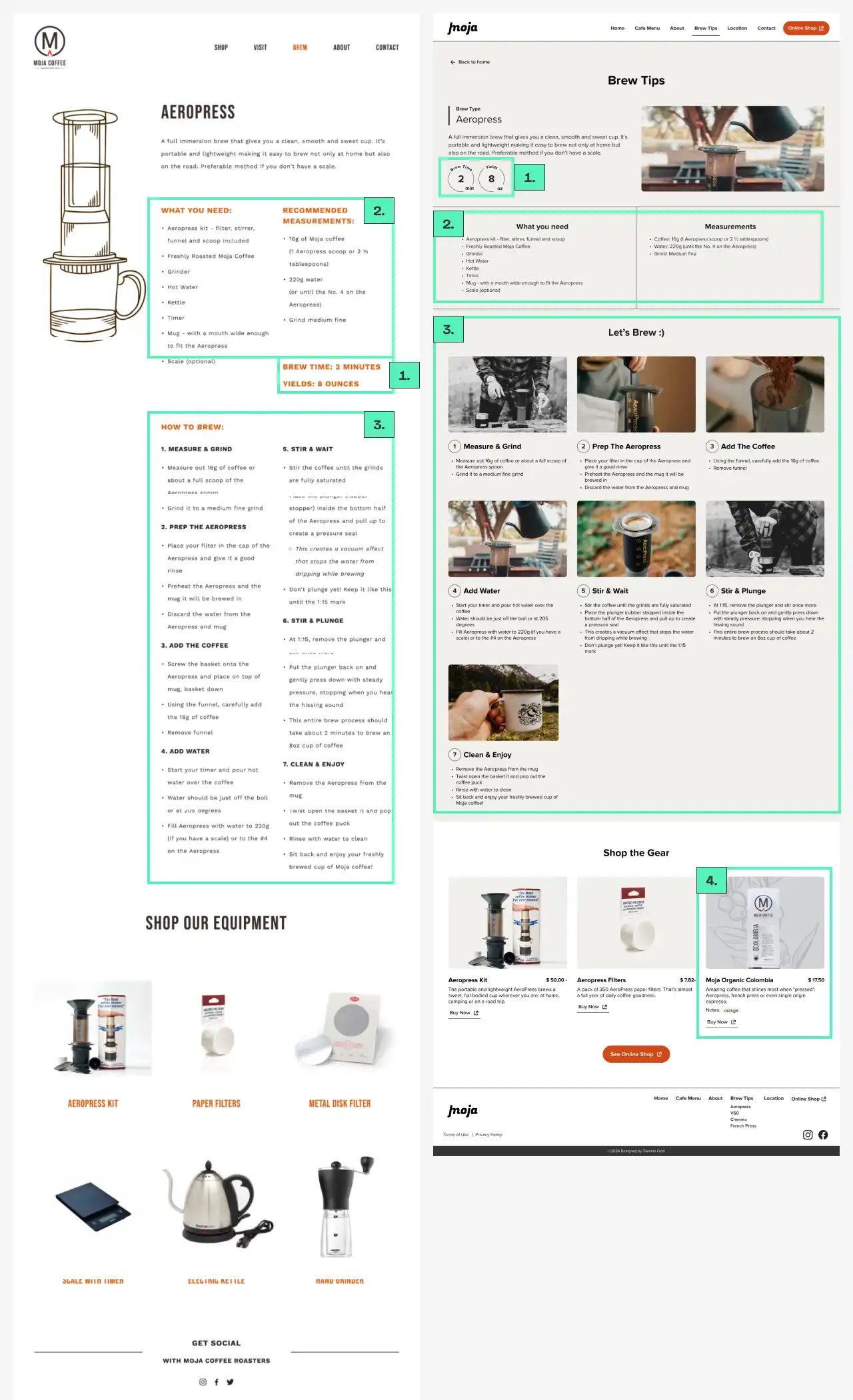
Before -> After
Emphasized visual information over text-based content. Designed with beginners in mind, including step-by-step brewing images to aid understanding. Also, the coffee beans that complement the brewing method were added as a CTA.
About

Before -> After
Optimized text amount and redesigned layout, cutting page length in half successfully.
5: Evaluate
5.1 Brand Perception Survey
To evaluate new design, I conducted the survey, 13 people are responded.
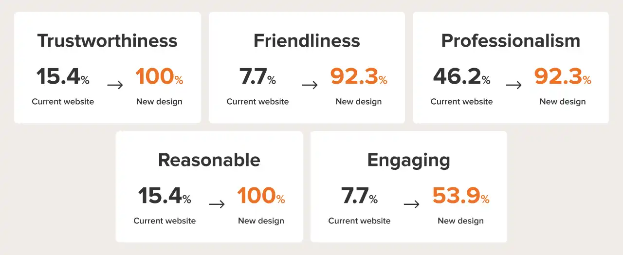
👍 Positive feedback
- I like the color scheme, it's light and airy, and makes me feel that if I went to the Cafe I would be able to have a nice relaxing visit. The website is very easy and clear to navigate.
- It looks more appealing, clean, and not overcrowded.
- I like the color and font better than those of the existing one. With less texts and more visual content, it catches my attention and motivates me to visit the shop.
✍ Next step
- The Cafe menu looks simple and feels a little cheap, and the About page could use a little more white space.
- (Already prototyped) In the cafe menu, quick information about ingredients or allergies would help.
- (Already prototyped) In the 'Menu' section, it might be beneficial to include the portion sizes alongside the prices.
6: Takeaway
- Agile Approach for User-Centric Solutions
- Throughout the project, while keeping the Agile process in mind, I gathered user feedback during the initial phase. This streamlined approach enabled me to effectively address genuine user pain points and create 4 iterative designs. By using dummy text and images, I maintained focus on priorities without getting bogged down in details, ensuring smooth progress.