 Back to Works
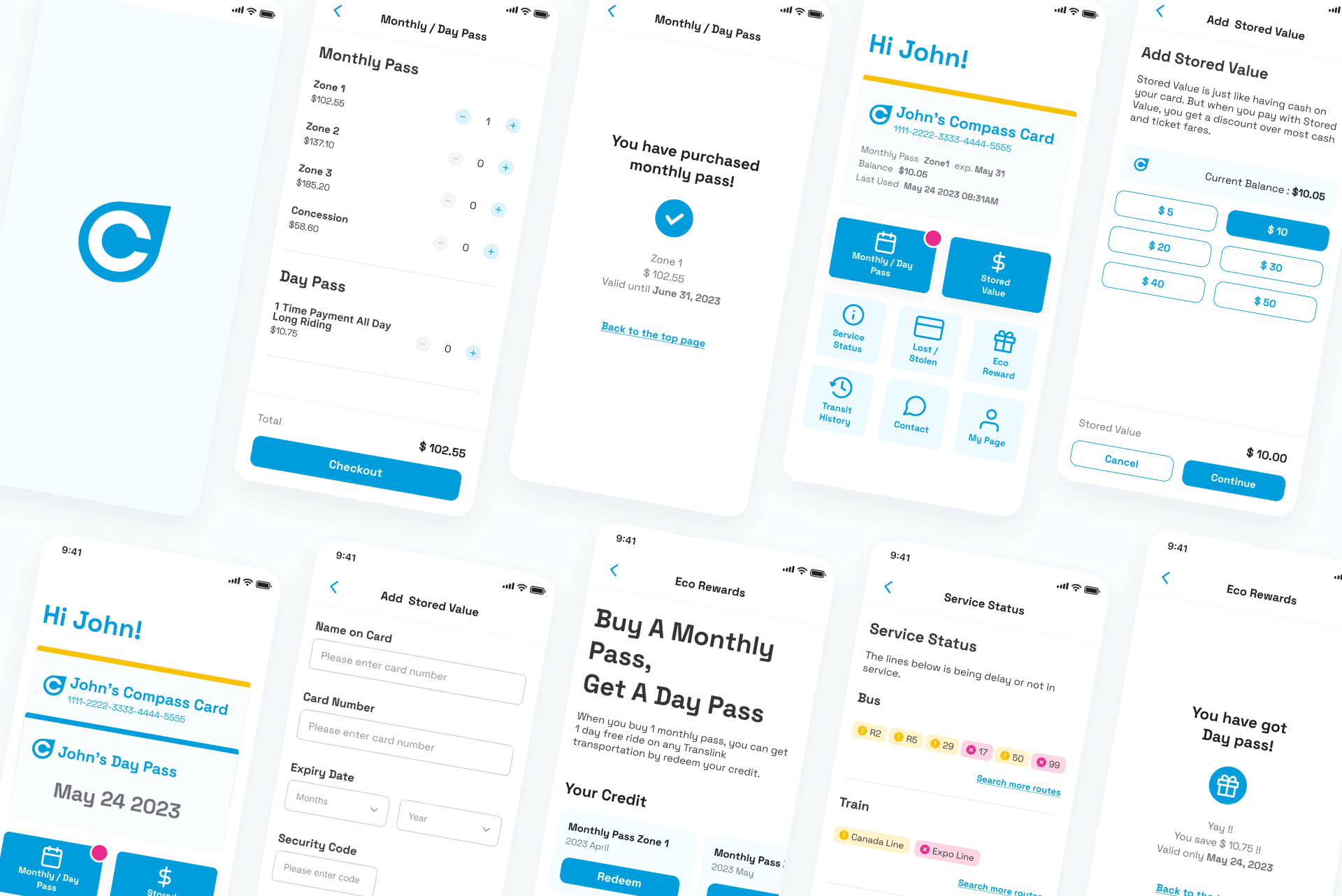
0: Prototype
1: Understand - Design Sprint
How might we make it easier for users to access quickly to the card/information they need?
Problem
While the Compass Card remains essential for residents in the Metro Vancouver area, its digitalization have still areas that could improve:
- There is no App of the Compass card.
- It takes time for users to find the information they need.
2: Sketch - Design Sprint
By conducting Crazy-8 and Solution Sketch, We identified three main areas for improvement.
- Online card: Helps users ride smoothly without looking for their card or keychain.
- Button menu: Makes it easier for users to find the information they need.
- Eco Rewards - New feature: Encourages users to use public transportation in their daily lives.

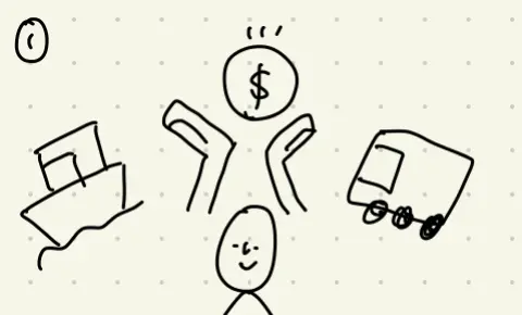
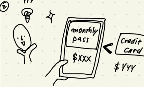
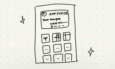
Crazy-8
Solution Sketch
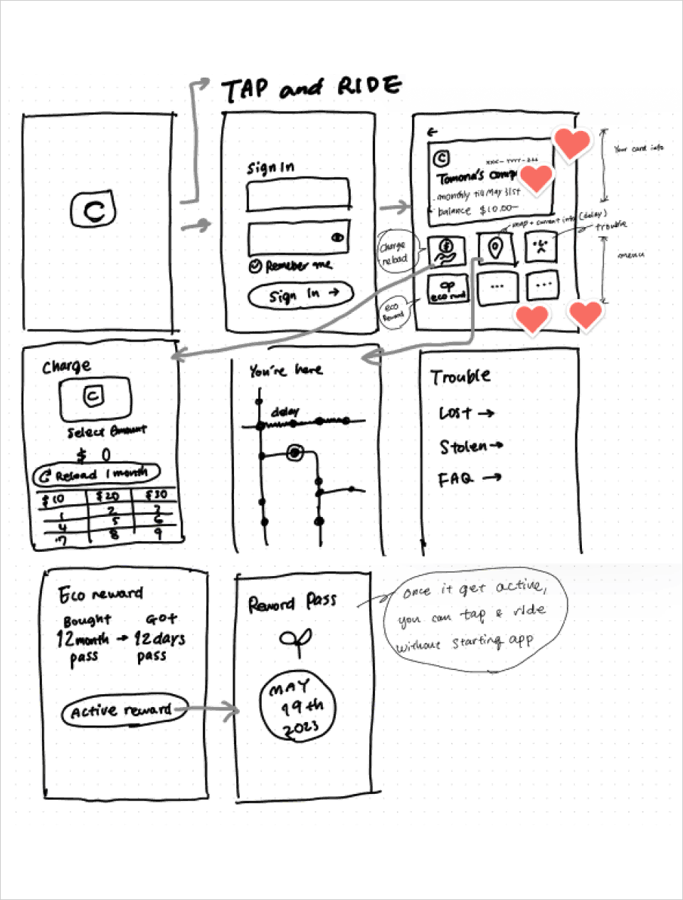
3: Decide - Design Sprint
We collectively mapped out the user flow for the app on a single board, using the ideas that had garnered the most votes during the Sketch phase.
John moved to Vancouver recently.
He decided to get monthly pass because he will use it several times in a day.
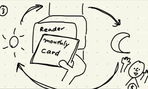
He was being satisfied with it until...
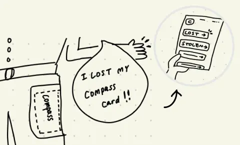
he lost his card as soon as he bought new monthly pass. He needed to find the way to his card's data back.
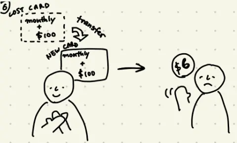
Fortunately, he had registered his card before losing it, so he could get back his monthly pass and remaining balance for $6 deposit.

As soon as he got the new card, he added his card to the Compass Card App not to lose anymore.
* When sketching out, we were thinking to put the card in a wallet app.
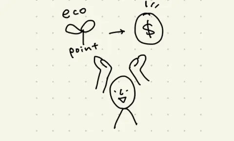
New feature "Eco Rewards" are motivating him to use it too.
In the Compass Card app, he can easily find the information he needs, which satisfied him!
4: Prototype - Design Sprint
We managed to create a high-fidelity prototype in about 4 hours. Thanks to the groundwork we had laid during the Understand-Sketch-Decide phases, we were able to work on the prototype while still thinking through the details, without having to pause and consider each step.
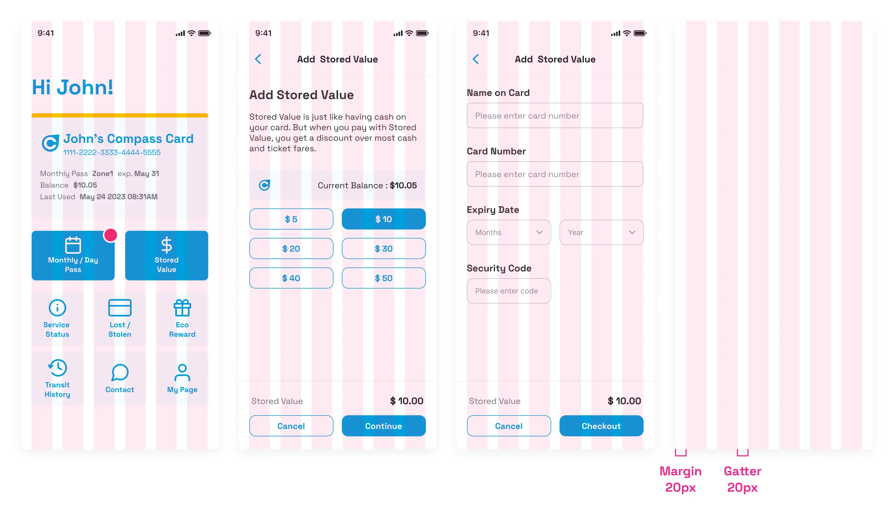
4.1 Final Screen
Home screen
Adding stored value screen
ECO Reward screen
4.2 Design System
Typography / Color / UI kit
The Compass card design takes into account a diverse user base, so we carefully chose colors and fonts with visibility in mind. In particular, we used the Space Grotesque font family, which combines contemporary friendliness with a variety of font weights to stay in tune with the times.

Grid System
A six-column grid was used to maintain consistency across screens and to facilitate adaptability to both two-column and three-column layouts.
5: Evaluate - Design Sprint
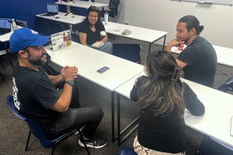
5.1 User Test
We carried out guerrilla usability testing with 4 participants and observed how they approached and completed the tasks we had assigned. Based on the insights and feedback gathered from this, we made improvements to the final design.

😊 Positive Feedback
- Purchasing pass and charging is easy to use.
- Maintenance info is convenient and helpful.
- Eco rewards is interesting, could be real.
🤔 Consideration
- By adding notification, people would realize their valance is run out or the monthly pass would be expired
- On the Service States page, there's no need to mention about the functioning lines.
6: Takeaway
6.1 Looking back and moving forward
- Perfection < Driving forward :
Trying the Google Design Sprint for the first time taught me the effectiveness of setting time limits to progress in design rather than perfecting each phase. I'm eager to embrace an agile mindset in future projects. - Designers joining usability tests :
I learned how user actions and words reveal hidden needs, enriching our understanding.